monday.com
Reporting
Intro
An Introduction to monday.com Reporting & What You Can Do
Table of Contents:
monday.com reporting is all about planning, tracking, and delivering the best teamwork. It allows you to use the platform in the most convenient way to display data and act on it. You can use monday.com reporting to track everything from time spent on projects to how much work individual team members do.
Once you collect the data from your team members, you get to create reports on the three platform levels: dashboards, boards, and workdocs. Moreover, you can set up widgets, or individual reporting tools, on each level to increase visibility and efficiency.
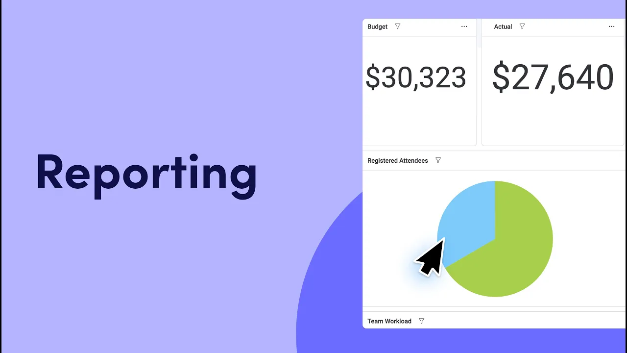
Dashboards facilitate the entire workflow and give you an overview of multiple boards. They help you keep track of everything relevant to you, from project progress to budget estimates. With more than 15 available widgets, you can also gather all the information in one view.
Under dashboards lay boards, the basic building blocks of monday.com. Boards act as specific screens for storing items, tasks, and responsibilities. You can use them with reporting widgets to track information conveniently.
Finally, workdocs act as consolidation centers for a single topic. People can use them to collaborate across teams and departments and brainstorm ideas. A workdoc reporting widget will give you information about the people and ideas discussed in that doc.
Widgets cover a variety of different reporting features. Some of the most useful ones for reporting on the monday.com platform include:
- Overview Widget: This widget is a high-level look at overall performance. It lives on your dashboard and summarizes your teams’ progress on the projects and boards you’ve selected.

- Workload Widget: You can use this widget to visualize the amount of work assigned to each team member and their upcoming deadlines.

- Time Tracking Widget: If you want to monitor time spent on projects, this widget actively tracks and displays that for one or multiple boards.

- Chart Widget: If you want to build a custom visual report, the Chart widget lets you pull information from several boards and display them in a single chart on your dashboard.

In this guide, you’ll learn everything you need to know about the basics of monday.com reporting and how it can help you improve your business.
Basic Reporting with monday.com
monday.com offers many basic reporting features to help you stay aligned with your goals. You can use them to manage boards and handle the presented information in the most convenient way.
Here are the most relevant reporting features you can leverage to your advantage:
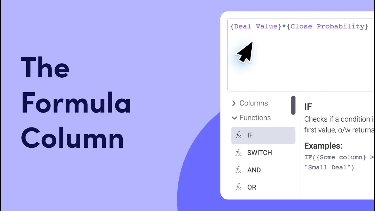
- Formulas: Boards look like spreadsheets, with multiple rows and columns. A formula column allows you to run calculations within other columns in the board to get specific results. For instance, you could use a formula column to compare team allocations with their actual spending to learn which groups on your board are under or over budget.
- Advanced Board Filters: As the name suggests, this feature helps you filter information on boards and narrow things down. You can use it to find specifics such as over-budget groups, late deadlines, or both.
- Chart Visualizations: You can switch your boards to “Chart View” to get a quick overview of your projects. The feature provides breakdowns and analytics to help you better manage your workflow.
- Report Sharing: You can create and share dashboards with other people to instantly give them access to the same up-to-date information you have.
These reporting features can help you manage your business more effectively. Whenever a team member adds new data, all your boards and dashboards get updated automatically. Your employees also get notified of changes and updates, so everyone can be on the same page. As a result, you will always have a finger on the pulse of activity in the departments.
With monday.com reporting, you don’t just see trends and historical data. You can also set up dashboards and charts to monitor OKRs, KPIs, EOS, and any other business metrics that matter to you. Whether you add integrations to the platform that automatically track data like inventory levels or you ask your staff to track the time they spend on projects, monday.com makes it easy to see all this information in one place.
monday.com Advanced Reporting Features
With monday.com's advanced reporting, big businesses can accomplish in-depth data analysis. Companies with a large workforce, many customers, or complex projects can study large amounts of data more closely. The process becomes as simple as it gets.
A few of the most valuable monday.com advanced reporting tools include:
- Stacked Charts: Advanced charts are more informative than standard ones as they display three parameters. They show the X and Y-axis parameters and include the third metric to analyze the workflow. For instance, you could track projects, time spent on tasks, and the person responsible for those tasks all in one place.
- Benchmarking: You can also add benchmarks to your charts along with cumulative data. These benchmarks make it easy to see how well your data compares to your targets and how much progress you make over time. Cumulative data also gives you an idea of which groups are performing best overall.
- Sentiment Reporting: If you use a board to collect textual information, you can turn to monday.com to help you analyze the sentiment of that text. For instance, if you have a board dedicated to customer feedback, you can generate a Word Cloud of that board. The Word Cloud takes all the text from the board and combines it into a visual "cloud" that displays the most often used keywords. This gives you a general idea of the tone of customer opinion.
- Pivot Boards: These make a critical tool for slicing and dicing data. You can use them to arrange information conveniently and achieve a deeper level of reporting through various perspectives. As a result, you'll gain invaluable insights and identify trends on your boards.
Tips for Getting Started with monday.com
The sheer amount of information you can analyze and visualize with monday.com is invaluable but can seem intimidating. Fortunately, the platform is super easy to use and understand. Once you get a handle on it, you'll find that all these tools are immensely helping your business. Here are a few tips to help you get started with the monday.com reporting process:
Consider Your Needs
There are multiple tiers of reporting features available on monday.com to support different business needs and budgets. The company offers Individual, Basic, Standard, Pro, and Enterprise level subscriptions.
The Enterprise level offers the most advanced reporting features, including pivot tables and consolidated dashboards. If you want to perform reporting on an organization-wide basis, it may be worth upgrading to the Enterprise level.
However, if you’re working with a relatively small team or don’t track that much information, you can use one of the other tiers. Every monday.com service tier offers powerful widgets and tools for reporting. You can choose the one that best meets the needs of your business.
Choose Your Priorities
Once you’ve selected your subscription tier, the tools within it will become available to you. To start managing your workflow, consider the information that matters most to you. What metrics do you want to track? What projects are of the highest importance? These are the things you should focus on first. Your priorities will determine how you set up your boards and widgets to see the much-needed information.
For example, suppose your main priority is monitoring your most successful salespeople. In that case, you can set up a chart widget on your dashboard that displays individual employees and their total sales. You could also track sales numbers against time worked to see which team members are most efficient.
Make Use of Columns and Groups
The monday.com Work OS works best for reporting when you give it the right information. If you want to track data, you need to include it on the relevant board. You can do so through groups, a collection of items that appear as color-coded rows. Groups get set based on item types such as employees, departments, projects, and more. Using them on your boards helps you organize your reports more clearly.
You can use columns as well. They can be your best friend for filtering data and producing reports that matter. Formula columns are even handier for simple analyses like whether a salesperson will meet the quota. You can then filter based on your columns to track performance and efficiency. With Enterprise, you can even use pivot tables to neatly slice your data based on column entries and display it conveniently.
Consolidate Project Data with Dashboards
The best way to get an overview of your entire business is to compare projects and groups to each other. On the monday.com platform, large companies can quickly generate and contrast dozens of boards. Dashboards let you put the most critical elements of multiple boards on the same page and see how they stack up against each other.
With monday.com’s Enterprise service, you can link up to 50 boards with a single consolidated dashboard for organization-wide reporting. You can check productivity across your entire workforce or compare progress on different projects with a single Enterprise dashboard. Whether you want a private overview of your business’s progress or you wish to present data to a board of directors, the Enterprise consolidated dashboard lets you see everything in one place.
Make monday.com Work for You
The monday.com platform is full of robust widgets and reporting functionalities that make it easy to see the data you need at a glance. Whether you only want a simple overview of how your team is doing or a cross-departmental analysis of your business workflows, monday.com can help.
If you’re still uncertain about the best way to use monday.com reporting, Polished Geek can help. Our experts can assist you in setting up your monday.com dashboards, boards, and workdocs with the reporting widgets that matter to you. Get in touch to learn how Polished Geek can support you in doing more with monday.com.